7 Tips for Designing a Photo Book
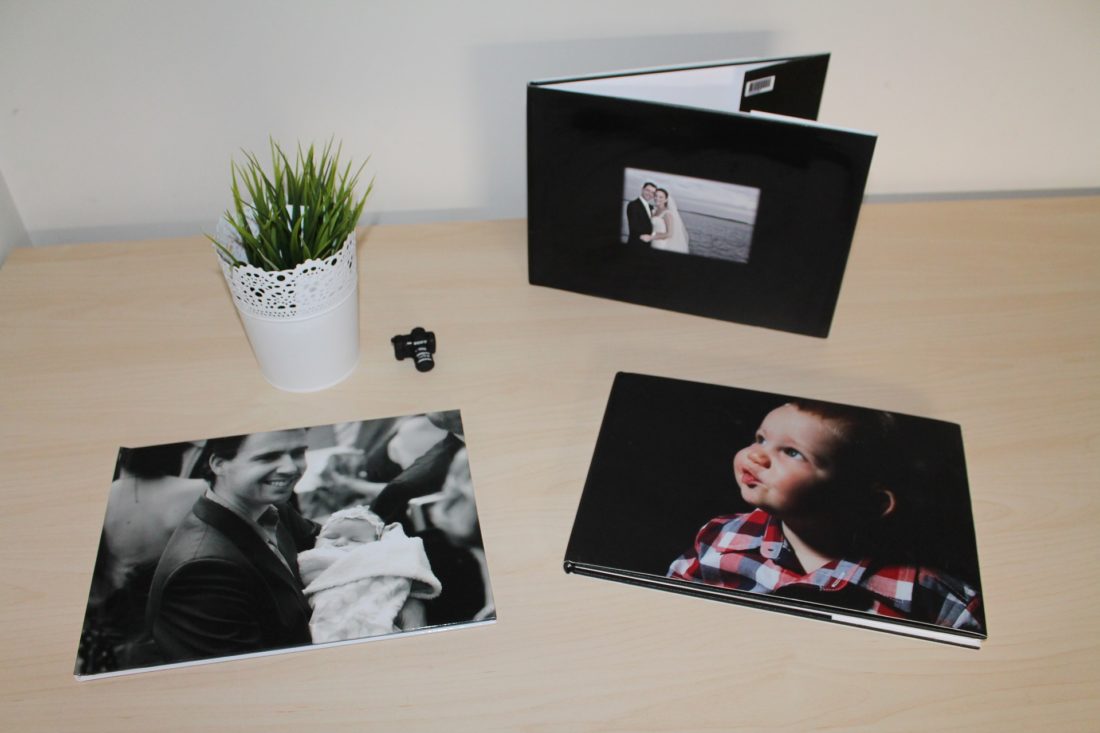
Photo books have become extremely popular over the years. They make excellent gifts and wonderful memories that you can keep around the house. Technology makes it pretty simple to design and make your own, but if you want a truly sensational memory book, you’ll want a few tips for the design.
- Use a Saddle Stitch Cover
As you go online to design your photo book, you’ll likely be assaulted with upcharge options when it comes to the binding. Don’t fall for it. You don’t need a hardcover book or threaded stitching unless you’re making a book larger than 100 pages. A simple saddle stitch binding (stapled binding) will serve you well.
“Saddle stitch booklets are great because they will lay flat and stay open when you are flipping through the pages, making it easier to read,” explains Amber Gauthier of Printing Center USA. “[It’s the] most popular binding type and offers the quickest turnaround time with the most affordable and cost-effective pricing.”
- Coordinate Colors
You have the option to place your photos on a plain white or black background or incorporate colors and patterns on each page. If you choose the latter, select colors that mesh together from page to page and that complement rather than overwhelm your photos.
For a truly aesthetic book, take a closer look at the photos themselves. Are there colors in one photo that might conflict with another on the page? You might consider using a consistent filter or all black-and-white photos if you’re worried about the colors clashing.
- Balance Your Layouts
Photo placement is so important for a beautiful design!
“Each side of the spread should complement the other,” writes blogger, photograph, and author Jessica Byam of Jest Kept Secret. “It can help you avoid cluttered pages and give certain images and layouts more or less ‘weight.’”
She also warns about letting photos touch, arguing that it creates a dysfunctional feel on the page. “I like to give them a little room around the edges, so pictures don’t blend together,” she says.
- Choose a Theme
Following a theme is a simple, yet highly effective strategy for creating a beautiful, balanced photo book. You might only include photos around a certain event or period. If the images were taken at the same location, they will likely look cohesive and blended, no matter how you lay them out.
You could also choose a theme for the page behind your photos. Most photo book design tools allow you to select a creative template with colors, graphics, and patterns that coordinate well with each other. If you’re not a design expert, this can be a great way to optimize your design.
- Write Creative Captions
It’s true that some photo books require no words—you can say a lot with beautiful imagery. However, there are other circumstances where you’ll want to address memories that are not pictured in the given frame.
If you add a caption, it should tell a story. Sometimes a short sentence will do it, but it’s okay to write a paragraph explaining some non-pictured detail.
Just make sure that it’s grammatically correct, as you don’t want people pointing out your grammar mistakes every time they flip through its pages!
- Upload High-Resolution Photos
If you want to avoid blurry photos, it’s all about high resolution.
Photos typically appear more pixelated in print than they do on your screen, so you might not realize that you have a low-resolution photo. Always check the size when uploading an image. Anything over 1,000 pixels on either side should be good, but if you’re blowing it up any larger, you’ll want 2,000 to 3,000-pixel photos minimum.
- Be Font Consistent
Some design trends encourage the use of many fonts, some of which are wild and hard to read. It may make a cool art piece, but when you’re trying to create a functional book. Consistent, readable, conservative fonts are best.
Choose a maximum of three fonts, although two is better. “Just remember: less is more,” says web designer Coletta Uliano, urging designers of all kinds to keep their fonts simple and practical.
She says she prefers using just two fonts. “I will choose a font to use for the main text, so any large headers or important pieces of information that I want people to see first. Then I choose a secondary font, something a little simpler in style than the first, for the body text.”
You want your photos to be the star of the book, so don’t use any distracting fonts to take away from that.
Ultimately, don’t overcomplicate the process. You likely have some design intuition and creativity up your sleeve, so let that guide your product. With these tips and your own inspiration, you’ll have a product worth cherishing for a lifetime!